People are often confused with the terms – Visual analytics and Visual Representations. They many times take both words for the same meaning – presenting a set of data into some kind of graphs which looks good to the naked eye. However deep down, ask an analyst and they will tell you that visual representation and visual analytics are two different arts.
Visual Representation is used to present the analyzed data. The representations directly show the output from the analysis and are of less help to drive the decision. The decision is already known with analytics already performed on data.
On the other hand, Visual analytics is an integrated approach that combines visualization, human factors, and data analysis. Visual analytics allows human direct interaction with the tool to produce insights and transform the raw data into actionable knowledge to support decision- and policy-making. It is possible to get representations using tools, but not interactive visual analytics visualizations which are custom made. Visual Analytics capitalizes on the combined strengths of human and machine analysis (computer graphics, machine learning) to provide a tool where alone human or machine has fallen short.
The Process
The enormous amount of data comes with a lot of quality issue where data would be of different types and from various sources. In fact, the focus is now shifting from structured data towards semi-structured and unstructured data. Visual Analytics combines the visual and cognitive intelligence of human analysts, such as pattern recognition or semantic interpretation, with machine intelligence, such as data transformation or rendering, to perform analytic tasks iteratively.
The first step involves the integration and cleansing of this heterogeneous data. The second step involves the extraction of valuable data from raw data. Next comes the most important part of developing a user interface based on human knowledge to do the analysis which uses the combination of artificial intelligence as a feedback loop and helps in reaching the conclusion and eventually the decision.
If the methods used to come to conclusion are not correct, the decisions emerging from the analysis would not be fruitful. Visual analytics takes a leap step here by providing methods/user interfaces to examine the procedures using the feedback loop.
In general, the following paradigm is used to process the data:
Analyze First – Show the Important – Zoom, Filter and Analyze Further – Details on Demand (from: Keim D. A, Mansmann F, Schneidewind J, Thomas J, Ziegler H: Visual analytics: Scope and challenges. Visual Data Mining: 2008, S. 82.)
Areas of Application
Visual Analytics could be used in many domains. The more prominent use could be seen in
- Financial Analysis
- Physics and Astronomy
- Environment and Climate Change
- Retail Industry
- Network Security
- Document analysis
- Molecular Biology
Today’s era greatest challenge is to handle the massive data collections from different sources. This data could run into thousands of terabytes or even petabytes/exabytes. Most of this data is in a semi-structured or unstructured form which makes it highly difficult for only a human to analyze or only a computer algorithm to analyze.
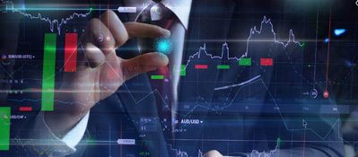
E.g. In the financial industry a lot of data (mostly unstructured) is generated on a daily basis and many qualitative and quantitative measures can be observed through this data. Making sense of this data is complex due to numerous sources and amount of ever-changing incoming data. Automated text analysis could be coupled with human interaction and knowledge (domain specific) to analyze this enormous amount of data and reduce the noise within the datasets. Analyzing the stock behavior based on news and the relation to world events is one of the prominent behavioral science application areas. Tracking the buy-sell mechanism of the stocks including the options trading in which the temporal context plays an important role, could provide an insight into the future trend. By combining the interaction and visual mapping of automated processed world events, the user could be supported by the system in analyzing the ever-increasing text corpus.
Another example where visual analytics could be fruitful is the monitoring of information flow between various systems used by financial firms. These products are very specific to the domain and perform specific tasks within the organization. However, there is an input of data which is required for these products to work. This data flows between different products (either from the same vendor or different vendor) through integration files. Sometimes, it could become cumbersome for an organization to replace an old system with a new one due to these integration issues. Visual analytic tools could provide the current state of the flow and could help in detecting the changes would be required while replacing the old system with a new system. It could help in analyzing which system would be impacted most based on the volume and type of data being integrated reducing the errors and minimizing the administrative and development expenses.
Visual analytics tools and techniques create an interactive view of data that reveals the patterns within it, enabling to draw conclusions. At Magic FinServ, we deliver the intelligence and insights from the data and strengthen the decision making. Data service team from Magic would create more value for your organization by improving decision making using various innovative tools and approaches.
Magic also partners with top data solution vendors to ensure that your business gets the solution that fits your requirements, this way we rightly combine the technical expertise with business domain expertise to deliver greater value to your business. Contact us today and our team will be happy to speak with you for any queries.